
Insights from eazyBI Community Days 2019
We were delighted to attend and present at eazyBI Community Days again in 2019.
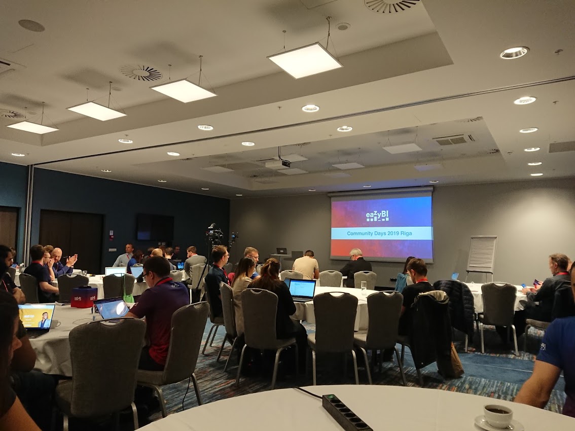
Over the course of 2 days in Riga, we got the opportunity to hear practical use cases and gain insights from a range of partners and customers in the Atlassian and eazyBI ecosystem.
So, what was it all about?
This was the third annual eazyBI user conference and is the biggest eazyBI event of the year.
eazyBI enables you to create business intelligence reports, charts, and dashboards with an easy-to-use drag-and-drop tool. Data can be imported from various sources including Excel, SQL, and REST. With a bit more experience, you can then start diving into more complex features such as defining your own reporting formulas using the MDX query language.
Targeting both new and experienced users of the product, this event is all about learning from and networking with the wider community. Theatre-style presentations were interspersed with lighting talks over the 2 days. eazyBI put on a great event and certainly brought the community together at the evening event hosted by the Drift Hall, where we all got the chance to race around a track on electric trikes at 50 km/hr!
Why did we go?
We have been huge fans of eazyBI for a number of years now, and have implemented many bespoke reporting solutions for customers that use eazyBI as a Jira app. We also use it ourselves!
Last year, our Technical Lead, Kris Siwiec showed how eazyBI can be combined with the Tempo product suite for portfolio oversight. This year, we followed a similar path, but combined forces with one of our customers Synergy Learning. Our very own Victor Lee presented with Peter Hinds on a project reporting solution using eazyBI and Profields. Here’s a nice relaxed snap before they kicked off 😊
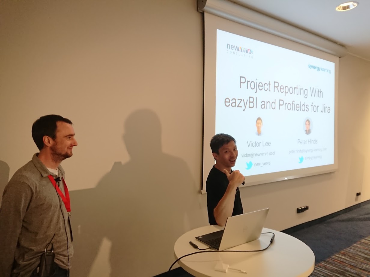
As an Atlassian Solution Partner, we applied our expertise in building a solution that reported on a number of key metrics including project status, workload, and revenue. We utilised Scriptrunner for Jira to extract and process project data from another Jira app: Profields. The processed data was then pulled into a cube for reporting in eazyBI.
What did we learn?
We took away a tonne of insights and this blog entry certainly doesn’t cover everything that happened over the two days. However, I’ve tried to highlight some key takeaways.
First up, I was intrigued by how successful eazyBI have been as a company with stellar year-upon-year growth. Recognised two years running as one of the top 50 Deloitte fast-growing companies in Central Europe, it’s even more amazing that eazyBI does all this in an entirely distributed setup. In other words, they don’t have a physical office - everybody works remotely. This of course comes with its own challenges and questions on how to maintain company culture and team morale. eazyBI seem to have found the right formula with regular group meetups, a packed schedule of events throughout the year, regular online team collaboration and of course the infamous morning team runs when everyone gets together in the same location.
Product announcements
eazyBI 4.6 and 4.7 have arrived with some nice new features, including:
- integration with Portfolio for Jira
- incremental REST API and SQL imports
- context-sensitive auto-completion for the calculated member formula editor
- the ability to share dashboards for wallboard mode
- support for importing customer satisfactions from Jira Service Desk
eazyBI 5.0 is upcoming and will include:
- various platform and library updates
- a new measures and dimensions UI (it’ll now be possible to filter by name and a single view will show all measures)
- out-of-the-box standard calculation measures (e.g. median, average, cumulative sum, linear trends)
- a new progress bar for Jira imports
- new integrations with Freshdesk and Bitbucket for DevOps reporting
- lots of small UX improvements, including a simple ‘x’ for removing measures without drag-and-drop!
Interestingly, eazyBI also announced that a brand new product eazyBI for Confluence will be announced soon. Keep your eyes peeled for the Beta.
Presentations
There were various presentations throughout the 2-day event, from eazyBI, partners, and of course customers.
Most participants were trying to achieve the same ultimate goal: to improve operational efficiencies by consolidating and automating reporting. Here are a few tips and tricks from some highlighted speakers:
- Build and test use cases; keep things simple; engage with eazyBI and the community! - Breann Jew from Shareworks
- Be careful with performance - Daina Tupule from eazyBI
- find the right KPIs among many!
- use JavaScript pre-calculations during import
- only pull relevant data in your imports - e.g. import by project, time, or domain
- Maximise engagement with your audience if you’re embedding eazyBi dashboards in external tools (e.g. Capterra, Concerto) - e.g. be careful with timings and don’t include too many slides! - Elvis Kvalbergs from Flex.bi
- Consider using eazyBI for your SAFe reports - with bespoke reporting, you can reliably gauge what % of commitment was actually delivered (not just number of story points) - Marten Thorand, demicon
Some really useful tips were shared by Jānis Gulbis from eazyBI in his presentation on the ‘Do’s and Don’ts of data Visualization’. Ultimately charts need to be simple and easy to understand:
- keep things simple: aim for 1 insight per chart!
- bear in mind the data-ink ratio: remove to improve
- use colours sparingly and try using contrast instead
- use the same colour scheme across your reports to ensure consistency
- remove redundant elements such as background, borders, and special effects
- make sure you sort by value, not name (except when working with time dimensions)
- try not to use pie charts - apparently humans aren’t very good at judging areas and angles!
- use tabular charts for small data sets
- keep your column and bar charts to a maximum of 5-7 measures
- use %‘s rather than numbers in column and histogram charts - also put the time dimension on the horizontal axis and work left-to-right
- don’t skip values in line charts and aim for < 45 degree slope
All of the presentations were recorded over the two days and will be made available on the eazyBI website. Keep an eye too on future events.
What next?
Get busy building reports in eazyBI!
We look forward to participating again in future events with eazyBI and other ecosystem vendors. They’re really a fantastic opportunity to share and network with the wider community, and we’d encourage customers and partners to partake in these valuable exercises.
Oh - and wouldn’t it be great if we could bring Riga’s drift racing to Scotland?!! (picture courtesy of eazyBI)

Comments:
There are no comments for this entry yet.